Duolingo Social
Language learning should be fun
Project Overview
In this course work gotten from a DA&D brief, Duolingo believes that language learning should be fun, which they have achieved by gamifying users’ experiences. However, they want users to continue to progress with their goals and practice as much as possible on the app
My Role
Solo student project for User Experience coursework.
Expertise
UI/UX Design
Tools
Figma
Adobe Illustrator
Adobe Photoshop
Deliverables
UI Screens
UX Flow
Prototype
Design Document
Timeline
8 weeks

Problem
Duolingo mostly teaches fundamental words and phrases from lexicons the user is forced to memorise, and because languages are complex, relying solely on Duolingo’s AI will leave users struggling to build proper grammar. Also, the app is designed as a game and does not encourage human to human interaction that promotes proficiency and encourages learning a foreign language.
Goal
The goal is to make the existing Duolingo users motivated to take their daily language lessons in an innovative way, by coming up with an idea that makes them keep opening the app to learn.
Design Idea
Learn by pairing with other users
1
Accountability Partners
-
A source of extrinsic motivation
-
More chances of accomplishing your goals
-
Develop a habit of practicing daily with someone to hold you accountable.
2
Interactive Learning
-
Book sessions with certified native speakers
-
Learn from verified Duolingo language instructors
-
Improved social interaction for better language learning.
3
Manage your Goals
-
Set, track, manage and execute goals.
-
Schedule classes as it suits you
-
Automatic deletion of files when session ends to create a sense of urgency to complete their tasks and classes.
Research
Further research from articles and interviews led me to discover that asking one or more people to be accountability partners will potentially help the user learn a lot from their unique learning methods, strategies and techniques. Therefore, learning with friends and as a group will ensure constant use of the app.
Competitive Analysis
The main rivals of Duolingo, such as Babbel, Mango, Memrise, and Mondly, were the subjects of my market research. I observed that not a single one of them used accountability partners to help clients achieve their objectives. This evolved into my go-to solution because it would increase the social and engaging aspects of the app.

User Interviews
I created interview questions regarding features, motivations, goals, and success factors. Without sharing the scope of the project, I interviewed about 6 of my course mates and 2 random students on campus using the questions, after which I was able to get some perspective on the subject. This data was then organised through affinity mapping.
Research Questions
-
How do you learn new languages?
-
What motivates you to keep taking the classes?
-
Did you encounter any difficulties when you started out?
-
What would be the best way for you to learn a language?
-
What do you think about an accountability partner?
Major Insights
Observing the motifs in my affinity map, I was able to deduce the following:
-
Collaboration: The interviewees felt that when learning with friends, they are most likely to keep using the app. Learning alone would make them lose interest quicker, procrastinate, and not stick to their goals.
-
Necessity: When asked what they would do in the event of a deadline, the interviewees responded that they'd experience a sense of urgency, which would motivate them to concentrate and complete their tasks.
User Persona
Observing the motifs in my affinity map, I was able to deduce the following:

Competitive Audit

Ideation
After conducting user research, I came up with various design alternatives and attempted to make this merely a function in the main Duolingo app. However, after giving it some more thinking, I realised that in order to actually come up with a solution, I would need to develop the feature into a stand-alone product that puts more of an emphasis on user interaction than on gamifying the learning process.
Usability Testing & Improvements
Over the course of four weeks, I tweaked my design based on input I'd gotten from my course mates and the course leader, making three important improvements:

1
Removal of 'Translate' Feature
-
The tutor's feedback indicated that having a translate option available on every chat bubble could be counterproductive in langugage learning because meanings may be lost in translation.
-
I initially opted for this feature to facilitate greater user adaptability.

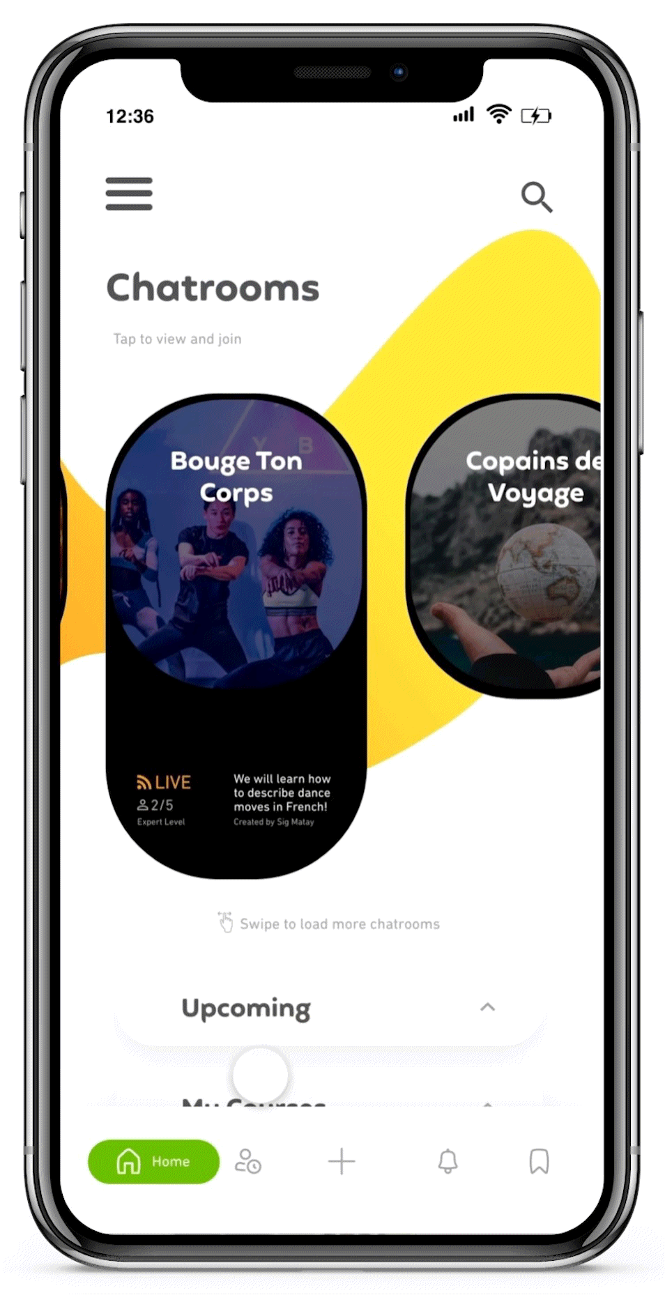
2
Adjusting the Navigation Menu
-
Navigation menu was looking crowded with lots of icons.
-
'Settings' and 'Profile' were moved to the side menu, giving room for 'Alerts' and 'Saved'.
-
Upon feedback, a search icon was added to top of screen.
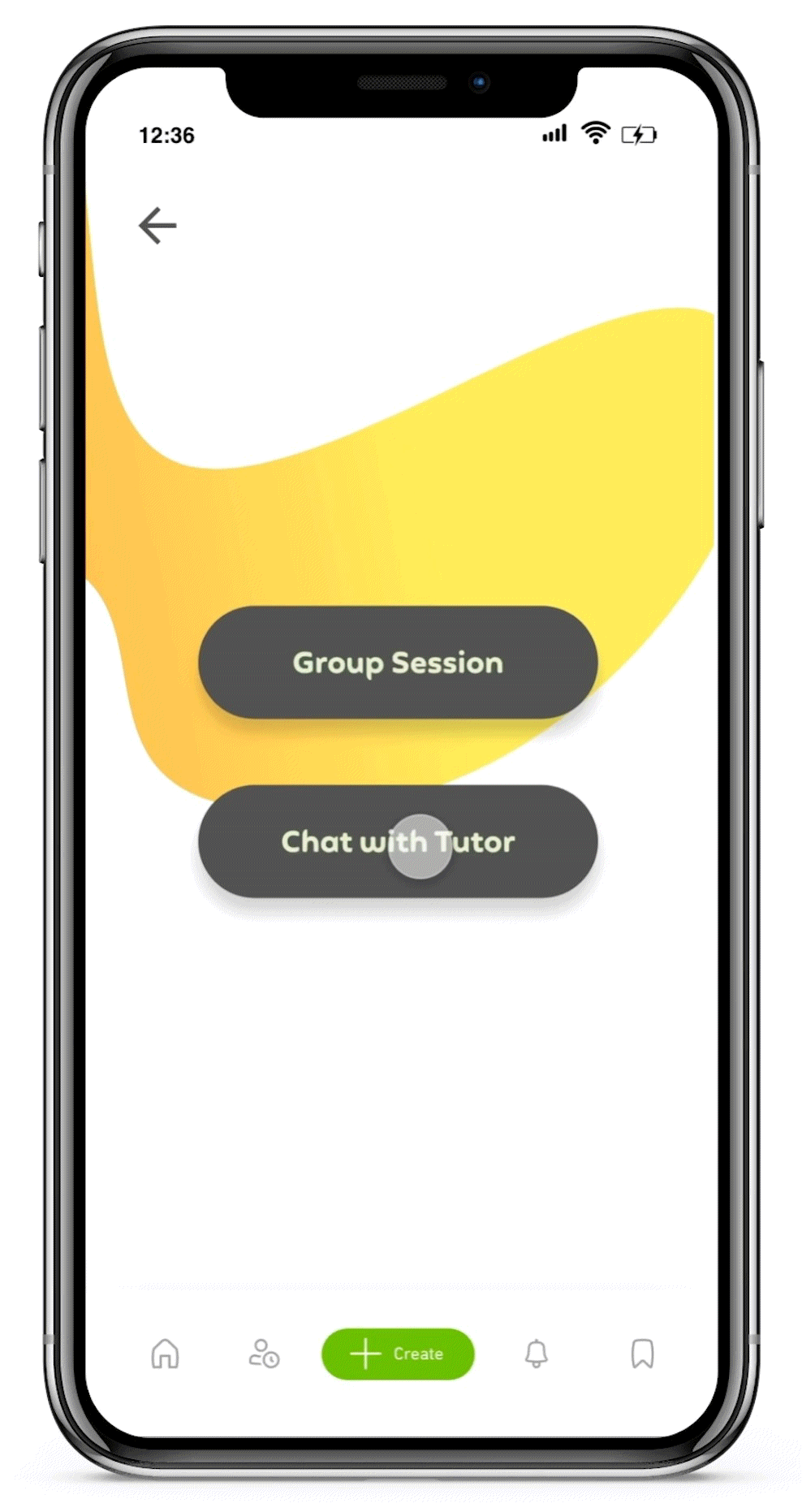
3
Introducing One-on-One Sessions
-
Designed as an alternative to group sessions.
-
Encourages personalisation of the user's learning experience.

Style Guide
Based off the existing Duolingo brand guidelines, I was able to modify and create a style guide for the product.

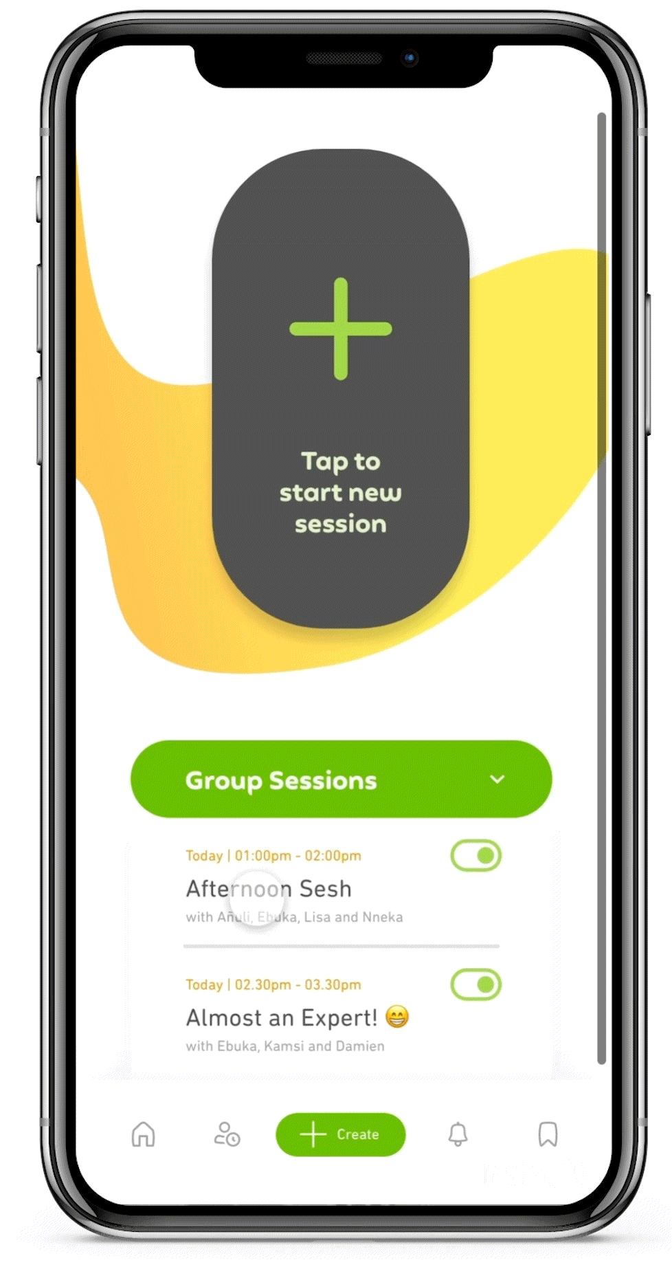
Final User Interface
Here are the relevant screens of the final design.


Conclusion
This was my first UI/UX project and upon completion, I am immensely grateful to have been able to complete this work. A few things I learnt:
-
Keep iterating. Don’t limit yourself. I explored different options and started afresh a couple of times I arrived at dead ends. Also, I learned to prioritise the needs of the users above mine. This saw me well ahead of the original app ideas I had.
-
Be flexible. I tried to use the established heuristics during the design development. However, while using them, I made sure I did not over rely on them but used them as a gentle guide applied to the user experience.
-
Be insight driven. I tried to focus on the main points of the project and did away with some unnecessary texts and screens